Crafting a Memorable Brand Identity
Your logo is the face of your brand. It’s the first thing people notice and the one element they’ll remember. A well-designed logo sets the tone for your business, builds trust, and differentiates you from competitors.
But what makes a logo truly perfect? It’s more than just an attractive design—it’s a strategic blend of simplicity, memorability, versatility, relevance, and timeless appeal.
In this guide, we’ll break down the essential elements of a perfect logo and explore how some of the world’s biggest companies have mastered the art of branding.
1. Simplicity
Less is More
A great logo should be clean, uncluttered, and easy to recognize. Overcomplicated designs can confuse your audience and dilute brand recognition.
Think of Nike’s swoosh—a single, fluid stroke that conveys motion and energy effortlessly.
Pro Tip: Avoid unnecessary details and complex graphics. A simple logo is easier to scale and reproduce across different platforms.
2. Memorability
Stand Out in a Crowd
Your logo should leave a lasting impression. A unique and distinctive design ensures that your audience remembers your brand after just a glance.
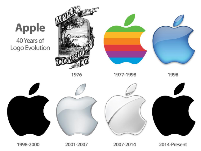
The Apple logo, for example, is iconic, easily recognizable, and universally associated with innovation and premium quality.
Pro Tip: Focus on creating a bold, recognizable shape that can stick in people’s minds.
3. Versatility
Adaptability Across Platforms
A logo must look great in any format—whether on a website, business card, social media profile, or billboard.
A strong example is the Adidas three-stripe logo, which maintains its effectiveness across product lines, color schemes, and different media formats.
Pro Tip: Test your logo in black and white, grayscale, and various sizes to ensure adaptability.
4. Relevance
Align with Your Brand Identity
A logo should reflect your brand’s values, industry, and personality. It should speak directly to your target audience.
Amazon’s smiley arrow (A to Z) conveys their promise of vast product selection and customer satisfaction—subtly forming a smile to reinforce their friendly approach.
Pro Tip: Research your audience and competitors to create a logo that resonates with your market.
5. Timelessness
Designed to Last
Trends come and go, but a great logo remains effective for decades.
The Coca-Cola script logo, virtually unchanged since the late 1800s, proves that a strong, timeless design can stand the test of time.
Pro Tip: Avoid trendy fonts, colors, or design elements that may quickly become outdated.
6. Color & Typography
The Psychology of Branding
Colors and fonts play a crucial role in how people perceive your brand.
McDonald’s golden arches paired with bold red evoke excitement, energy, and hunger. The right typography reinforces your brand’s personality—whether it’s sleek and modern or bold and playful.
Pro Tip: Choose a color palette that evokes the right emotions and limit fonts to one or two for a cohesive look.
7. Scalability
Clarity at Any Size
Your logo should be clear and recognizable whether it’s on a mobile app icon or a massive billboard.
The Mastercard logo, with its simple overlapping red and yellow circles, is a great example. Whether it’s on a tiny credit card chip or a huge billboard, it remains instantly recognizable. The minimalist design ensures clarity across all platforms, from digital to print.
Pro Tip: Make sure your logo remains legible and recognizable even when resized.
Need a Stunning Logo for Your Business?
A perfect logo is more than just a design—it’s a strategic brand asset.
Whether you need a fresh design or a brand refresh, ReDefined is ready to bring your vision to life.

Leave a comment